This picture:
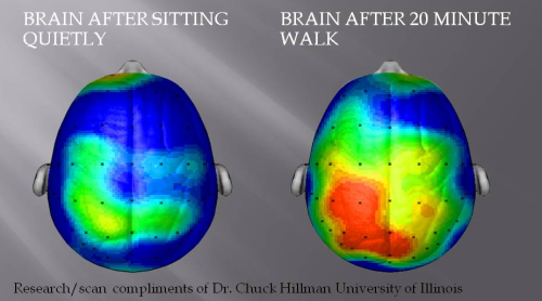
…occasionally does the rounds on Twitter, often spurred by tweets from the kind of evidence-phobic accounts that publish whole lists of mind-blowing ‘facts’, at least 50% of which are made up. This picture has also spurred about a billion blog posts (like here, here and here), somewhat unsurprisingly, written by the kind of people who like to get their scientific evidence from a single image on Twitter.
So what’s the problem here? What the image appears to suggest at face value is that brain activity is increased after a short bout of exercise (a 20-minute walk). Sounds reasonable, right? We know that exercise has various effects on brain function, and exercise in general is definitely a good thing, now that the Western world is suffering from massive rates of obesity, diabetes, etc. I really don’t have a problem with the message here, more in the way that it’s presented.
The brain images are clearly from an EEG, but beyond that, there’s very little information in the images about what it actually represents. There are lots and lots of different things you can measure with EEG technology, such as the P300, Error-Related Negativity, C1 and P1, or much slower neural oscillations across a wide range of frequency bands. We have no information about what particular measure this image is describing. Secondly, we have no information about what the colours mean. Heat-map colour scales on brain images like this often represent statistical values (usually t or z scores), which is a convenient way of representing a large amount of numerical data in a visual-friendly format. Here though, we have no colour-scale information, so we have no idea what the colours represent.
Here’s some brain images I just created from some MRI data I had laying around. Took about three minutes.
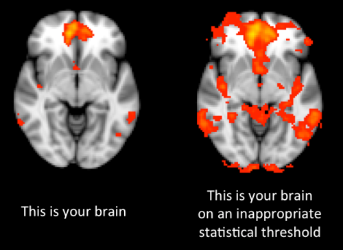
Big difference, right? Somewhat counter-intuitively, the left and right images above are actually the exact same functional brain data, all I did to create the right one was to lower the statistical threshold on the colour-overlay, to essentially say “Show me more results, I don’t care if they’re statistically reliable or not.” People who do this kind of work are very clued-in to these kinds of issues, and would always look for a colour-scale on these kinds of images in research papers. Clearly though the general public aren’t that conversant with statistical issues in brain imaging, because why would they be?
What we do have in the original image is an attribution to a guy called Chuck Hillman at the University of Illnois. Dr Hillman appears to be a perfectly respectable scientist, performing some perfectly respectable research focussing on the interaction between exercise and the brain. I have absolutely no problem with Dr Hillman or his obviously very worthwhile research. Looking through his articles, I can’t find an image which matches the one at the top of the post, although this paper (PDF, Figure 2, page 548) does contain one that’s somewhat similar. That image shows the amplitude of the p300 wave during a particular task, after a period of reading and a period of exercise. Unfortunately the colour-scale here is in raw units of EEG signal (micro-volts) so it’s not totally clear if that represents a statistically-significant difference or not. If anyone can work out where the original image at the top comes from, please let me know in the comments!
As something of an aside, is an increase in brain activity necessarily a positive thing? Oxidative stress can potentially occur as the result of an increase in brain metabolism, and oxidative stress has been implicated as a potential causal factor in a huge variety of problems, from cancer to Alzheimer’s. One could even argue that lower brain activity is better because it indicates a more efficient use of cognitive resources; performing the same task, with less activity, equals greater efficiency. Although using the concept of ‘efficiency’ in this way is currently fairly controversial.
The essential point here is that when images like this are presented in academic papers or presentations, they come packaged with a whole host of caveats, qualifications, and additional information. Of course, scientists often try to make visually arresting images in order to present their results with maximum impact and clarity, and (as long as they don’t cheat in some way) that’s entirely appropriate, and indeed useful. The problem comes when someone else takes those images, strips them of this essential contextual information and presents them uncritically, often in order to further their own agenda or aims. Without the context, these images become pretty much meaningless. If this kind of thing happened to some result from my own research, I’d be pretty embarrassed about it. As ever, a critical approach to this kind of un-critically presented ‘evidence’ is crucial.


The power of a well-chosen image; EEG measures of brain activity and exercise
This picture:
…occasionally does the rounds on Twitter, often spurred by tweets from the kind of evidence-phobic accounts that publish whole lists of mind-blowing ‘facts’, at least 50% of which are made up. This picture has also spurred about a billion blog posts (like here, here and here), somewhat unsurprisingly, written by the kind of people who like to get their scientific evidence from a single image on Twitter.
So what’s the problem here? What the image appears to suggest at face value is that brain activity is increased after a short bout of exercise (a 20-minute walk). Sounds reasonable, right? We know that exercise has various effects on brain function, and exercise in general is definitely a good thing, now that the Western world is suffering from massive rates of obesity, diabetes, etc. I really don’t have a problem with the message here, more in the way that it’s presented.
The brain images are clearly from an EEG, but beyond that, there’s very little information in the images about what it actually represents. There are lots and lots of different things you can measure with EEG technology, such as the P300, Error-Related Negativity, C1 and P1, or much slower neural oscillations across a wide range of frequency bands. We have no information about what particular measure this image is describing. Secondly, we have no information about what the colours mean. Heat-map colour scales on brain images like this often represent statistical values (usually t or z scores), which is a convenient way of representing a large amount of numerical data in a visual-friendly format. Here though, we have no colour-scale information, so we have no idea what the colours represent.
Here’s some brain images I just created from some MRI data I had laying around. Took about three minutes.
Big difference, right? Somewhat counter-intuitively, the left and right images above are actually the exact same functional brain data, all I did to create the right one was to lower the statistical threshold on the colour-overlay, to essentially say “Show me more results, I don’t care if they’re statistically reliable or not.” People who do this kind of work are very clued-in to these kinds of issues, and would always look for a colour-scale on these kinds of images in research papers. Clearly though the general public aren’t that conversant with statistical issues in brain imaging, because why would they be?
What we do have in the original image is an attribution to a guy called Chuck Hillman at the University of Illnois. Dr Hillman appears to be a perfectly respectable scientist, performing some perfectly respectable research focussing on the interaction between exercise and the brain. I have absolutely no problem with Dr Hillman or his obviously very worthwhile research. Looking through his articles, I can’t find an image which matches the one at the top of the post, although this paper (PDF, Figure 2, page 548) does contain one that’s somewhat similar. That image shows the amplitude of the p300 wave during a particular task, after a period of reading and a period of exercise. Unfortunately the colour-scale here is in raw units of EEG signal (micro-volts) so it’s not totally clear if that represents a statistically-significant difference or not. If anyone can work out where the original image at the top comes from, please let me know in the comments!
As something of an aside, is an increase in brain activity necessarily a positive thing? Oxidative stress can potentially occur as the result of an increase in brain metabolism, and oxidative stress has been implicated as a potential causal factor in a huge variety of problems, from cancer to Alzheimer’s. One could even argue that lower brain activity is better because it indicates a more efficient use of cognitive resources; performing the same task, with less activity, equals greater efficiency. Although using the concept of ‘efficiency’ in this way is currently fairly controversial.
The essential point here is that when images like this are presented in academic papers or presentations, they come packaged with a whole host of caveats, qualifications, and additional information. Of course, scientists often try to make visually arresting images in order to present their results with maximum impact and clarity, and (as long as they don’t cheat in some way) that’s entirely appropriate, and indeed useful. The problem comes when someone else takes those images, strips them of this essential contextual information and presents them uncritically, often in order to further their own agenda or aims. Without the context, these images become pretty much meaningless. If this kind of thing happened to some result from my own research, I’d be pretty embarrassed about it. As ever, a critical approach to this kind of un-critically presented ‘evidence’ is crucial.
14 Comments
Posted in Commentary, Medical
Tagged brain, EEG, exercise